

Page structure
Every page is built from a hierarchy of four element types:Sections (green)
Sections (green)
Sections are the largest building blocks of a page. Each section spans the full width of the canvas and typically represents a distinct visual region such as a hero, features block, or footer.
Rows (blue)
Rows (blue)
Rows live inside sections and organize content horizontally. A section can contain multiple rows stacked vertically.
Columns (lilac)
Columns (lilac)
Columns divide a row into vertical lanes. Use them to create side-by-side layouts — for example a text block next to an image.
Elements (orange)
Elements (orange)
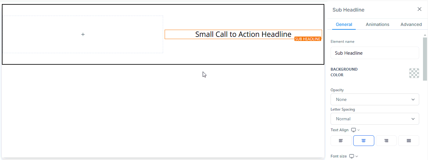
Elements are the individual content pieces you place inside columns: text, images, buttons, videos, forms, timers, and more.
Builder toolbar
Add elements
Open the Add Elements panel from the left toolbar to add:- Sections, Rows, Columns, Elements — the four structural building blocks
- Prebuilt Sections — professionally designed layout templates to speed up your workflow
- Saved Sections — reusable sections you have created and saved across pages
- Widget Marketplace — third-party and community widgets
- Forms and Surveys — embed forms or surveys directly in the page
- Social Media Icons — links to your social profiles
- Countdown Timers — create urgency with deadline timers
- Progress Bars — display goals or sign-up progress
Layers panel
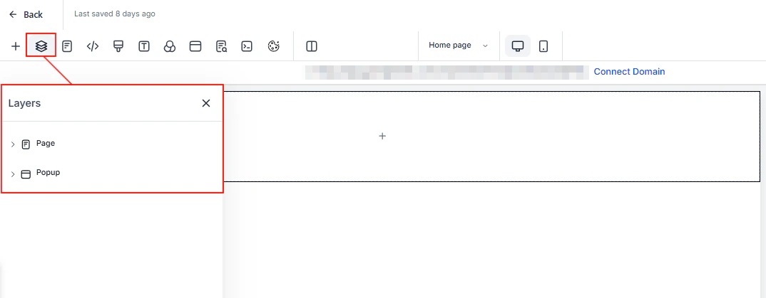
The Layers panel shows the complete structure of your current page, organized as a nested tree of sections, rows, columns, and elements. Use it to select, rearrange, or hide elements quickly. You can also switch between the Page layer and any Popup layers.Pages panel
The Pages panel lists every page inside the current funnel or website. Click any page to navigate to it in the editor.
Page settings
Access page-level settings from the top toolbar:Tracking code
Tracking code
Paste header or footer code (e.g. Google Analytics, Facebook Pixel) into the dedicated Tracking Code popup. The code is injected into every page load.
Custom CSS
Custom CSS
Add custom CSS rules that apply to the current page. Useful for fine-grained style overrides beyond the visual editor.
Typography
Typography
Change the default text and link colors and adjust the global font size for headlines and body content.
Background
Background
Set the page background to a solid color, gradient, or image. Enter a custom hex code if the color picker does not have the exact shade you need.
Popup
Popup
Add an overlay popup to the page. Click Open Popup Settings to control trigger behavior, timing, and appearance.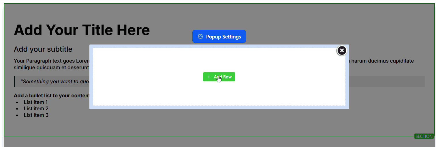
SEO meta data
SEO meta data
Configure the page title, meta description, keywords, author, social share image, canonical URL, and language. An SEO preview shows how the page will appear in search results.
Cookie consent
Cookie consent
Top toolbar actions
| Control | Purpose |
|---|---|
| Pages dropdown | Switch between pages in the funnel or website |
| Desktop / Mobile toggle | Preview and edit in responsive mobile view |
| Undo / Redo | Step backward or forward through edit history |
| Versions | Review and restore previous saved states of the page |
| Preview | Open a live preview of the page in a new tab |
| Save | Save all changes without publishing |
| Publish | Push saved changes live to the public URL |
Available elements
The builder includes a rich library of drag-and-drop elements:Content elements
Headline, Sub-Headline, Paragraph, Bullet List, Rich Text, Text Element
Media elements
Image, Video, SVG, Photo Gallery, Image Slider, Image Feature, Logo Showcase
Interactive elements
Button, Form, Survey, FAQ, Countdown, Minute Timer, Day Timer, Progress Bar, Navigation Menu
Commerce elements
1-Step Order Form, 2-Step Order Form, Order Confirmation, Pricing Table, 1-Step Order Form
Embed elements
Code (custom HTML/JS), Calendar, Map, QR Code Element
Social elements
Social Share Element, Blog Post, Testimonial Element, Number Counter Widget
Advanced features
Global and universal sections
Global and universal sections
Global sections are saved once and referenced across multiple pages within the same funnel or website. Editing the global section updates every page that uses it. Universal sections work the same way but can be shared across multiple funnels and websites in your account.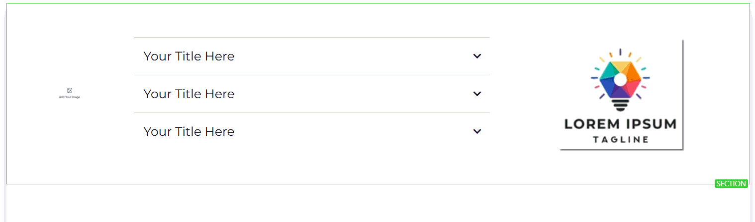
Block editor
Block editor
The block editor offers a structured, template-based editing approach inside a section. It is particularly useful for landing pages where you want a consistent grid layout.
Brand boards
Brand boards
Brand boards let you store your color palette and typography presets. When you apply a brand board to a funnel or website, all compatible elements update to match your brand instantly.
Content AI
Content AI
Ask AI to generate or rewrite copy for any text element directly inside the builder. Select a text element and click Ask AI to open the prompt interface.
Prebuilt section templates
Prebuilt section templates
Browse a library of professionally designed section templates and insert them into any page with one click. Prebuilt sections cover common use cases such as hero banners, feature grids, testimonials, pricing tables, and CTAs.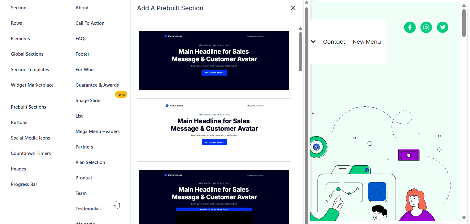
Keyboard shortcuts
Keyboard shortcuts
The builder supports keyboard shortcuts for common actions. Open the shortcuts reference from the help icon in the top toolbar.
Tips
Always click Save before closing the builder, then Publish to make changes visible to visitors. Saving without publishing keeps the changes in draft state.