> ## Documentation Index
> Fetch the complete documentation index at: https://help.hoopai.com/llms.txt
> Use this file to discover all available pages before exploring further.
# Opportunity reporting
> Track pipeline value, conversion rates, stage distribution, and deal velocity using dashboards, funnel charts, and the opportunity reporting tools in HoopAI.
Opportunity reporting gives you the metrics you need to understand the health of your pipeline, identify where deals stall, and forecast revenue with confidence. The HoopAI platform provides several reporting tools for opportunities — from at-a-glance dashboard widgets to detailed filtered views you can export for deeper analysis.
***
## Reporting overview
Opportunity data flows into your reporting through three main surfaces:
1. **Dashboard widgets** — configurable tiles on your main dashboard showing pipeline metrics at a glance
2. **Funnel chart** — a sequential visualization of how opportunities progress through your stages
3. **Stage distribution chart** — a snapshot of how many open deals currently sit in each stage
4. **Filtered list views** — use filters and sorting in list view to create ad hoc reports and export them to CSV
***
## Key metrics explained
### Conversion rate
The conversion rate measures how many opportunities result in a Won outcome as a percentage of all opportunities created.
**Formula:** Won opportunities ÷ Total opportunities × 100
For example, if you created 50 opportunities in a month and 10 were marked Won, your conversion rate is 20%.
The Won stage is automatically included in conversion rate calculations. Use the date range filter on your dashboard to limit the calculation to a specific time period.
### Pipeline value
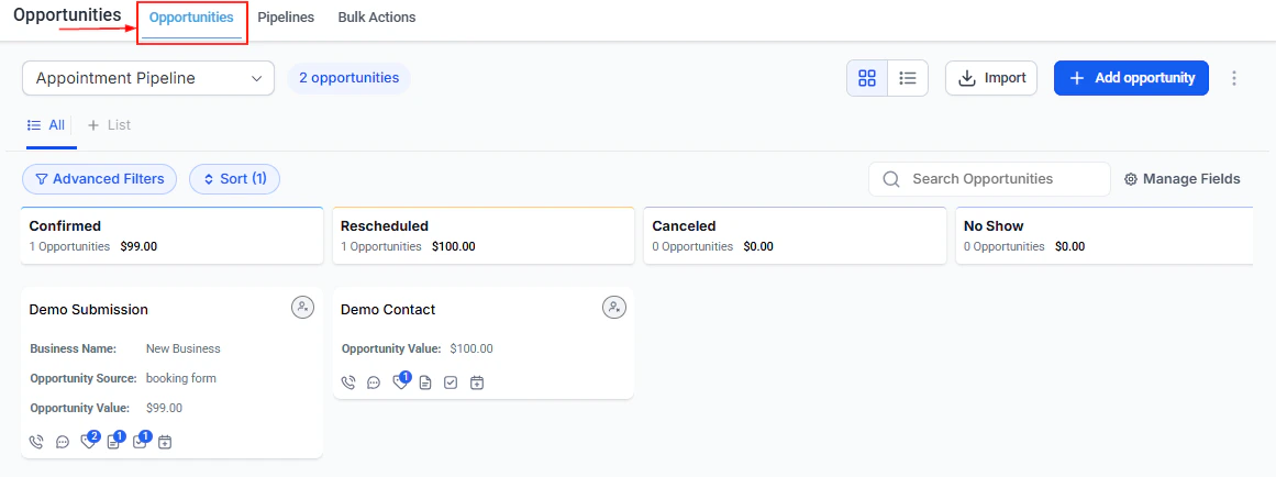
Pipeline value is the sum of the monetary values of all currently open opportunities. You can view this:
* **By stage** — the total at the top of each column on the kanban board
* **Across all stages** — as a single pipeline value widget on your dashboard
* **Filtered** — by pipeline, assigned user, tag, or any other filter
Use pipeline value to understand how much potential revenue is in play and where it is concentrated.
 ### Stage-to-stage conversion
Stage-to-stage conversion measures the percentage of opportunities that advance from one stage to the next (rather than stalling or falling out of the pipeline). This identifies bottlenecks — stages where deals drop off at a disproportionate rate.
If 100 deals enter your Proposal stage but only 40 advance to Negotiation, you have a 40% stage-to-stage conversion at that point. That is a signal to investigate: is the proposal the problem, is pricing an issue, or are deals simply not the right fit by that stage?
### Deal velocity
Deal velocity tracks how quickly opportunities move through your pipeline — the average number of days deals spend in each stage or from creation to close. Slow-moving deals are visible through the "days since stage change" field, which appears on opportunity cards and in list view.
Use velocity data to:
* Identify which stages cause the most delay
* Set follow-up task triggers for deals that have been inactive for too long
* Compare velocity across team members to surface coaching opportunities
### Won vs. Lost value
### Stage-to-stage conversion
Stage-to-stage conversion measures the percentage of opportunities that advance from one stage to the next (rather than stalling or falling out of the pipeline). This identifies bottlenecks — stages where deals drop off at a disproportionate rate.
If 100 deals enter your Proposal stage but only 40 advance to Negotiation, you have a 40% stage-to-stage conversion at that point. That is a signal to investigate: is the proposal the problem, is pricing an issue, or are deals simply not the right fit by that stage?
### Deal velocity
Deal velocity tracks how quickly opportunities move through your pipeline — the average number of days deals spend in each stage or from creation to close. Slow-moving deals are visible through the "days since stage change" field, which appears on opportunity cards and in list view.
Use velocity data to:
* Identify which stages cause the most delay
* Set follow-up task triggers for deals that have been inactive for too long
* Compare velocity across team members to surface coaching opportunities
### Won vs. Lost value
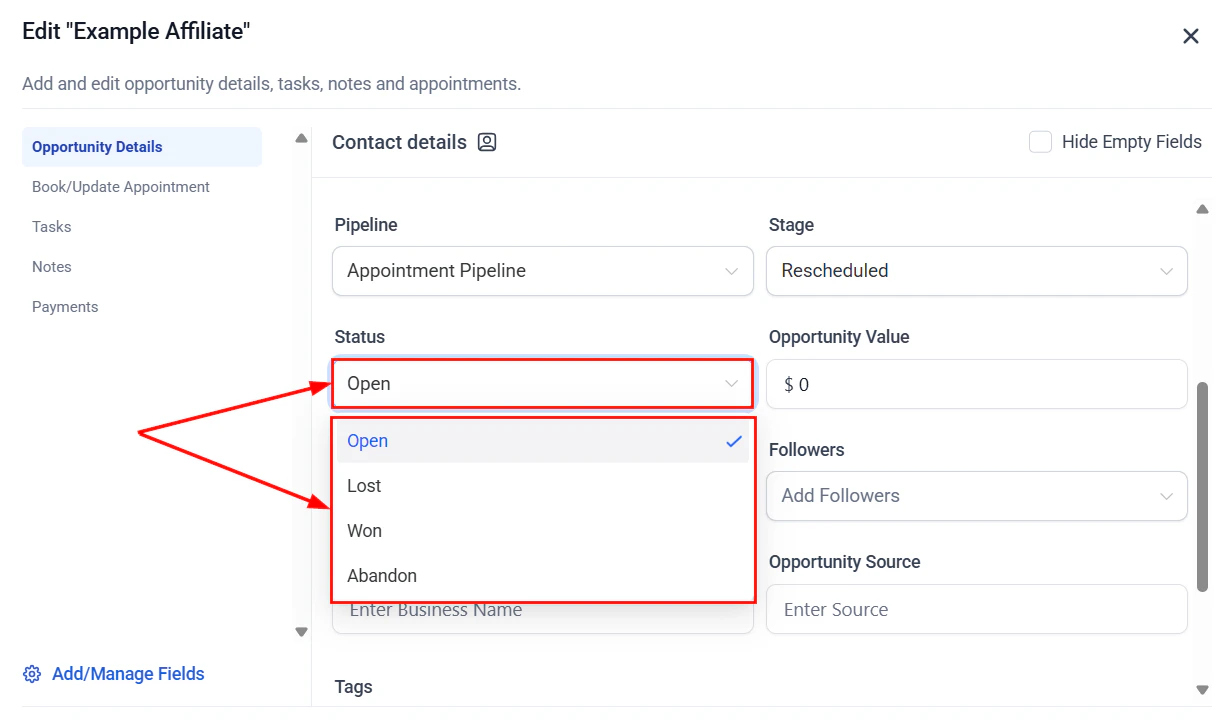 Tracking the total value of Won and Lost opportunities over time reveals revenue trends and the cost of losing deals. A spike in Lost value in a given period warrants investigation — was it one large deal or many small ones? Were they lost to a competitor or for pricing reasons?
***
## Dashboard widgets for opportunities
To add an opportunity widget to your dashboard:
Navigate to **Dashboards** from the sidebar. Select an existing dashboard or create a new one.
Click **+ Add Widget** and select **Opportunities** as the widget type.
Set the parameters for the widget:
* **Pipeline** — which pipeline(s) to include
* **Date range** — the period the data covers (today, this week, this month, custom range)
* **Metric** — the specific value to display (see options below)
* **Assigned user** — optionally filter to a specific team member's opportunities
Click **Save** to add the widget to your dashboard.
Tracking the total value of Won and Lost opportunities over time reveals revenue trends and the cost of losing deals. A spike in Lost value in a given period warrants investigation — was it one large deal or many small ones? Were they lost to a competitor or for pricing reasons?
***
## Dashboard widgets for opportunities
To add an opportunity widget to your dashboard:
Navigate to **Dashboards** from the sidebar. Select an existing dashboard or create a new one.
Click **+ Add Widget** and select **Opportunities** as the widget type.
Set the parameters for the widget:
* **Pipeline** — which pipeline(s) to include
* **Date range** — the period the data covers (today, this week, this month, custom range)
* **Metric** — the specific value to display (see options below)
* **Assigned user** — optionally filter to a specific team member's opportunities
Click **Save** to add the widget to your dashboard.
 ### Available opportunity widget metrics
| Metric | Description |
| ------------------------ | ----------------------------------------------------- |
| **Total opportunities** | Count of opportunities created in the selected period |
| **Won opportunities** | Count of Won deals in the selected period |
| **Lost opportunities** | Count of Lost deals in the selected period |
| **Conversion rate** | Won ÷ Total as a percentage |
| **Total pipeline value** | Sum of all open deal values |
| **Won revenue** | Sum of values for Won opportunities |
| **Lost value** | Sum of values for Lost opportunities |
| **Average deal value** | Mean value across selected opportunities |
***
## Funnel chart
The funnel chart visualizes how opportunities flow sequentially through your pipeline stages — showing cumulative counts from each stage through to Won.
**How it works:**
Each bar in the funnel represents a stage. The value shown is the cumulative count of opportunities that reached that stage and every subsequent stage (including Won). This gives you a true funnel view — where did deals enter and how many made it all the way through?
The conversion rate shown in the funnel widget is the percentage of opportunities that advanced from each stage to the next.
**Requirements to show a stage in the funnel:**
* The stage must have **Visible in Funnel Chart** enabled in Pipeline Settings
* The widget requires **Dashboard stats** permission
**Configuration:**
The funnel widget includes a dropdown to switch between different pipelines. The date range is based on the `last_status_change_date` of opportunities rather than the created date — this reflects when deals actually moved through stages.
If you have a holding stage (like "Nurture" or "On Hold") that is not part of the linear sales path, disable its funnel chart visibility in Pipeline Settings so it does not distort the sequential funnel visualization.
***
## Stage distribution chart
The stage distribution chart shows the **current count** of open opportunities in each stage. Unlike the funnel chart, it is not cumulative — it is a snapshot of where deals are right now.
This chart is useful for monitoring live pipeline health: how many deals are in each stage at this moment, and is the distribution healthy or is everything piling up in one place?
Won and Lost opportunities are displayed separately rather than alongside open stage counts.
**Requirements to show a stage in the distribution:**
* The stage must have **Visible in Pie Chart** enabled in Pipeline Settings
* The widget requires **Dashboard stats** permission
The stage distribution widget also shows a per-stage conversion rate: the percentage of opportunities that have been converted to each specific stage out of all opportunities created.
***
## Reporting with filters and exports
For detailed, ad hoc reporting, use list view with filters and the CSV export:
**Common reports you can build:**
* **Lost deal analysis** — filter to Status = Lost + date range → export → analyze lost reasons, values, and stages in a spreadsheet
* **Stale pipeline review** — filter to Status = Open + last activity older than 14 days → see which deals need follow-up
* **Rep performance** — filter to a specific Assigned User + Won status + date range → compare total Won value across team members
* **Close date urgency** — filter to Close date this month + Status = Open → surface deals that should be prioritizing this week
* **Source analysis** — filter by lead source to compare conversion rates and values across acquisition channels
After applying filters:
1. Review the results in list view
2. Click the three-dot menu → **Export Opportunities**
3. The CSV downloads with all fields including custom fields
***
## Reviewing your pipeline regularly
Schedule a weekly pipeline review using the filters you use most often as saved presets. Look at deals by close date, value, and last activity in sequence to identify the right priorities for the week.
A structured review cadence:
* **Weekly** — filter for deals closing this month + open status. Review velocity and follow-up tasks.
* **Monthly** — review conversion rate trends, Won/Lost ratios, and which lost reasons dominate. Adjust process or messaging if patterns emerge.
* **Quarterly** — review average deal value trends, stage-to-stage conversion, and compare performance across team members or lead sources.
***
## FAQs
The conversion rate is Won opportunities divided by total opportunities (all statuses) in the selected period, expressed as a percentage.
The funnel widget uses the last\_status\_change\_date of opportunities — not the created date. This means the funnel reflects when deals actually moved through stages.
Yes. When configuring an opportunity widget, you can restrict it to show data for a specific team member. This makes it easy to build individual or team performance dashboards.
In Pipeline Settings, enable or disable the Visible in Funnel Chart toggle for each stage. Stages marked invisible are excluded from the funnel visualization but are still available on the board and in filters.
Yes. Use list view with the relevant filters, then click the three-dot menu and select Export Opportunities. The CSV includes all fields including custom fields.
Yes. All reporting widgets and exports support filtering by status, including Won and Lost. The funnel chart includes Won opportunities in its final cumulative count.
### Available opportunity widget metrics
| Metric | Description |
| ------------------------ | ----------------------------------------------------- |
| **Total opportunities** | Count of opportunities created in the selected period |
| **Won opportunities** | Count of Won deals in the selected period |
| **Lost opportunities** | Count of Lost deals in the selected period |
| **Conversion rate** | Won ÷ Total as a percentage |
| **Total pipeline value** | Sum of all open deal values |
| **Won revenue** | Sum of values for Won opportunities |
| **Lost value** | Sum of values for Lost opportunities |
| **Average deal value** | Mean value across selected opportunities |
***
## Funnel chart
The funnel chart visualizes how opportunities flow sequentially through your pipeline stages — showing cumulative counts from each stage through to Won.
**How it works:**
Each bar in the funnel represents a stage. The value shown is the cumulative count of opportunities that reached that stage and every subsequent stage (including Won). This gives you a true funnel view — where did deals enter and how many made it all the way through?
The conversion rate shown in the funnel widget is the percentage of opportunities that advanced from each stage to the next.
**Requirements to show a stage in the funnel:**
* The stage must have **Visible in Funnel Chart** enabled in Pipeline Settings
* The widget requires **Dashboard stats** permission
**Configuration:**
The funnel widget includes a dropdown to switch between different pipelines. The date range is based on the `last_status_change_date` of opportunities rather than the created date — this reflects when deals actually moved through stages.
If you have a holding stage (like "Nurture" or "On Hold") that is not part of the linear sales path, disable its funnel chart visibility in Pipeline Settings so it does not distort the sequential funnel visualization.
***
## Stage distribution chart
The stage distribution chart shows the **current count** of open opportunities in each stage. Unlike the funnel chart, it is not cumulative — it is a snapshot of where deals are right now.
This chart is useful for monitoring live pipeline health: how many deals are in each stage at this moment, and is the distribution healthy or is everything piling up in one place?
Won and Lost opportunities are displayed separately rather than alongside open stage counts.
**Requirements to show a stage in the distribution:**
* The stage must have **Visible in Pie Chart** enabled in Pipeline Settings
* The widget requires **Dashboard stats** permission
The stage distribution widget also shows a per-stage conversion rate: the percentage of opportunities that have been converted to each specific stage out of all opportunities created.
***
## Reporting with filters and exports
For detailed, ad hoc reporting, use list view with filters and the CSV export:
**Common reports you can build:**
* **Lost deal analysis** — filter to Status = Lost + date range → export → analyze lost reasons, values, and stages in a spreadsheet
* **Stale pipeline review** — filter to Status = Open + last activity older than 14 days → see which deals need follow-up
* **Rep performance** — filter to a specific Assigned User + Won status + date range → compare total Won value across team members
* **Close date urgency** — filter to Close date this month + Status = Open → surface deals that should be prioritizing this week
* **Source analysis** — filter by lead source to compare conversion rates and values across acquisition channels
After applying filters:
1. Review the results in list view
2. Click the three-dot menu → **Export Opportunities**
3. The CSV downloads with all fields including custom fields
***
## Reviewing your pipeline regularly
Schedule a weekly pipeline review using the filters you use most often as saved presets. Look at deals by close date, value, and last activity in sequence to identify the right priorities for the week.
A structured review cadence:
* **Weekly** — filter for deals closing this month + open status. Review velocity and follow-up tasks.
* **Monthly** — review conversion rate trends, Won/Lost ratios, and which lost reasons dominate. Adjust process or messaging if patterns emerge.
* **Quarterly** — review average deal value trends, stage-to-stage conversion, and compare performance across team members or lead sources.
***
## FAQs
The conversion rate is Won opportunities divided by total opportunities (all statuses) in the selected period, expressed as a percentage.
The funnel widget uses the last\_status\_change\_date of opportunities — not the created date. This means the funnel reflects when deals actually moved through stages.
Yes. When configuring an opportunity widget, you can restrict it to show data for a specific team member. This makes it easy to build individual or team performance dashboards.
In Pipeline Settings, enable or disable the Visible in Funnel Chart toggle for each stage. Stages marked invisible are excluded from the funnel visualization but are still available on the board and in filters.
Yes. Use list view with the relevant filters, then click the three-dot menu and select Export Opportunities. The CSV includes all fields including custom fields.
Yes. All reporting widgets and exports support filtering by status, including Won and Lost. The funnel chart includes Won opportunities in its final cumulative count.